

Using Data to Address Racial Bias in Soccer Commentary

Article by Adedamola Ladipo, Photo by Pixabay
The 2020 Union of European Football Associations (UEFA) European Football Championship in summer 2021 was one of the most exciting soccer tournaments in years. Following the highs and lows of each match, I was left feeling inspired to create a soccer-related data visualization. After some searching, I came across an intriguing article called "Racial Bias in Football Commentary (Study): The Pace and Power Effect ''. The report was based on a study by RunRepeat, who conducted research in partnership with The Professional Footballer's Association (PFA). They analyzed 2,073 statements from commentators in 80 soccer matches from the 2019 to 2020 season. The study's findings found "bias from commentators who praised players with lighter skin tones as more intelligent, as being of higher quality, and harder working than players with darker skin tone." Around this time, I also recalled the brilliant proportion plot by Stephanie Evergreen. This seemed like the perfect opportunity to put this new chart type to use with data on a poignant and informative topic. This brief text chronicles my thought process in creating a data visualization in Tableau called Racial Bias in Soccer Commentary.
What is a proportion plot?
"Proportion plots help us compare the share of population between two metrics. It uses length on the left and right sides of the chart. It connects the lengths by a band in the middle that swoops a lot if there is disproportionality and stays even if the proportions are the same" Stephanie Evergreen
My plan was to do something slightly different with the proportion plot but stick to the general principle. I focused on the 'praise' and 'criticism' [figure 1] data from the RunRepeat article because a proportion plot was a perfect chart type to tell the data story. Rather than showing shares of a population, my chart would show the difference in commentators' share of praise vs. criticism of darker vs. lighter skin players. I selected the data describing comments on players' intelligence, versatility, quality, and work rate during matches to narrow the scope to four proportion plots.
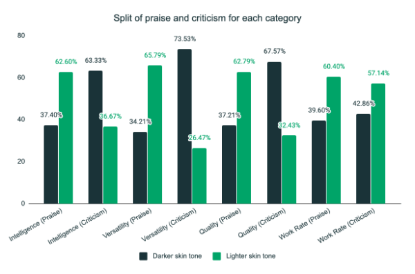
Figure 1. Praise and Criticism data from RunRepeat article. Source: Racial Bias in Football Commentary (Study): The Pace and Power Effect
How to create the plot in Tableau?
Once I decided to create a proportion plot, it was time for me to figure out how to do it in my preferred data visualization tool, Tableau. Thanks to a brilliant blog post by Ken Flerlage, a proportion plot Tableau template was already available to use. If you don't already read the Flerlage Twin Brothers and Tableau Zen Masters data visualization blog posts, you should! The guidance, tips, and tools in each of their posts are invaluable and easy to follow. Using the existing Tableau proportion plot tool saved me considerable time.
The next step was the data collection, which was also straightforward. First, I pulled the data on criticism and praise of players' intelligence, versatility, quality, and work rate directly from the charts and tables in the article into a Google sheet [Figure 2]. Next, I set the data up in the format required for the proportion plot template mentioned earlier by Ken Flerlage. Again, check out the blog post mentioned above for details on exactly how the data needs to be set up.

Figure 2. Setting up the data in the format required for the proportion plot.
Now that I had the topic, the data, and the template design for the plot, I was almost ready to create the visualization in Tableau. I sketched out a variety of ideas but ultimately settled on something simple. I wanted the proportion plot visualization to speak for itself and be the primary focus - and I also did not want to spend my whole weekend working on it.
After the sketches were completed, I decided on the colors, title design, and font for the visualization. The colors were inspired by The Guardian and Financial Times [Figure 3], which often use a variation of orange and teal.
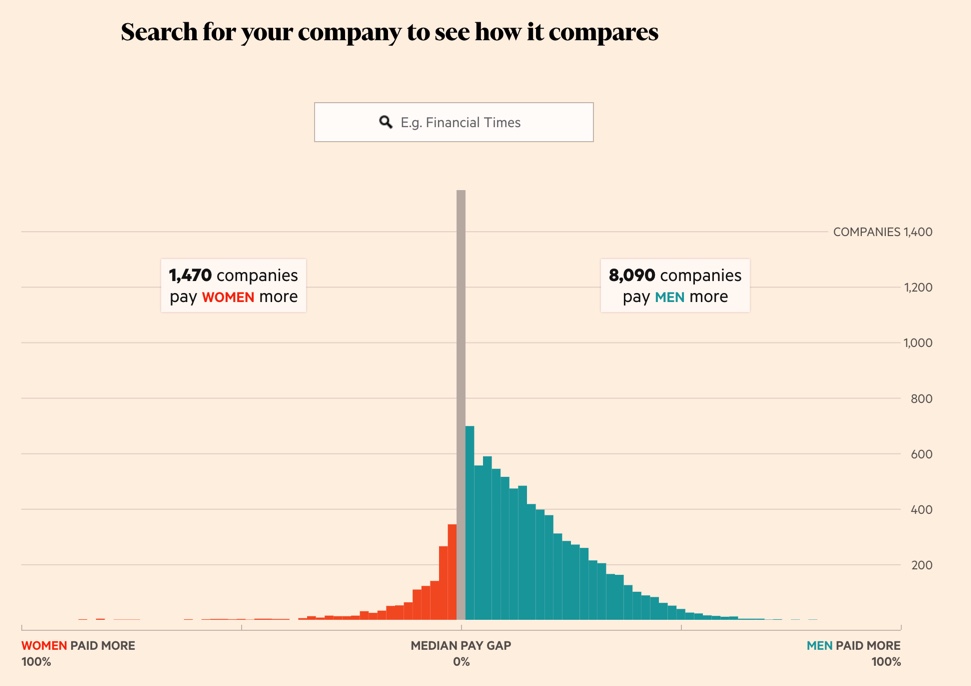
Figure 3. Damola Ladipo's visualization was inspired by the color scheme from this Financial Times piece. Source: Financial Times
Working out the design elements.
I typically like to incorporate an element of the data visualization in the design of my titles. For example, using an image or color in a title that relates to the chart(s) in the visualization can give readers an initial idea of what the graphic is about or provide additional consistency in design. In this case, I decided to use the colors for players with lighter skin, teal, and players with darker skin, orange [Figure 4], for both the actual proportion plot and the "Racial Bias" title text. The diagonal division in the “Racial Bias” text was meant to communicate the topic of proportion to the reader.
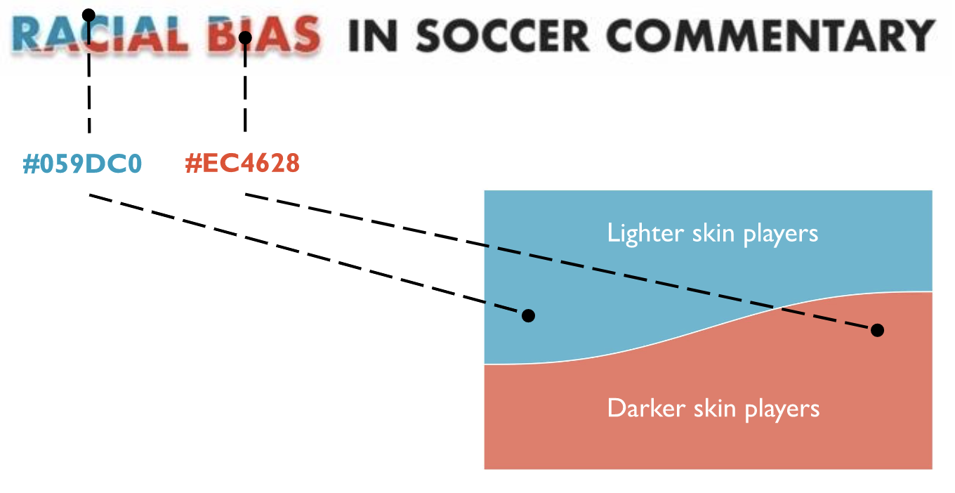
Figure 4. Damola believes that using an image or color in a title that relates to the charts can give readers an initial idea of what the visualization is about.
The font used for the labels in the visual and the title was Futura, which I chose for no reason other than it's one of my favorite fonts because of its geometric appearance. The narrative text selected was Courier New to portray the effect of a typewriter. I also colored the labels in the description text for an additional 'in text legend' for readers.
The next step was to actually create the plots. Each proportion plot comprised a right and left stacked column chart and a curved area chart [figure 5]. I made each stacked column chart 100% opacity and the curved area chart in the center 60% opacity. I felt that this design best highlights the difference in the share of praise vs. criticism values and the lighter curved area plot subtly guides the eyes to show the stark change/difference in values. Also, something about the smooth yet steep transition from right to left in the proportion plot is aesthetically appealing.
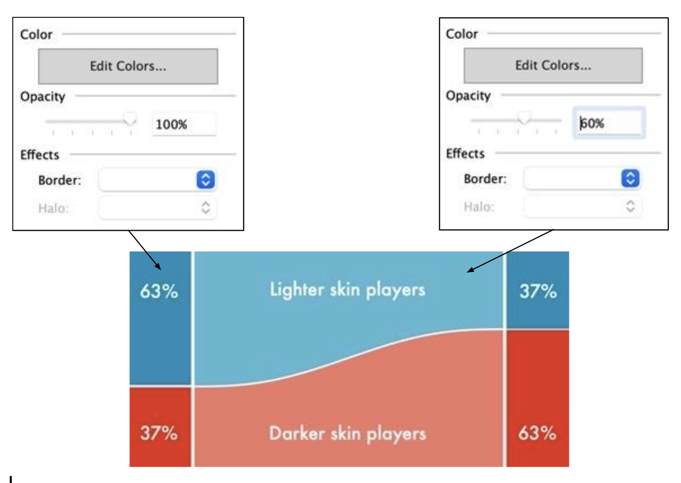
Figure 5. Damola shares how he went about designing the plots through adjusting the opacity.
The last touch in the visual was a shadow behind each proportion plot. To do this, I created four transparent rectangular shapes in Figma, each the same height and width as the plot. I then placed the drop shadows behind each of the four proportion plots. As I mentioned earlier, I wanted the visualization to be the primary focus. Therefore, the subtle shades around each chart made them slightly pop out on the page for an eye-catching look.
The completed visual was essentially three layers [figure 6]. The first layer was the title, description text, and footer with the data source and my name. The second layer was the drop shadows for each of the four proportion plots. And the third and final layer was the actual proportion plots created in Tableau.
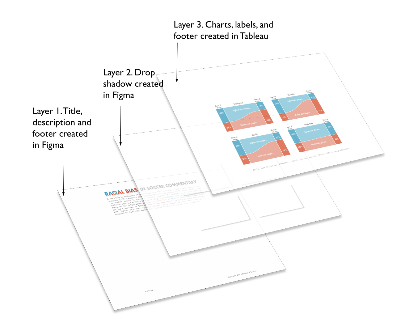
Figure 6. The three layers combined created the final visualization below [figure 7]
Finishing touches.
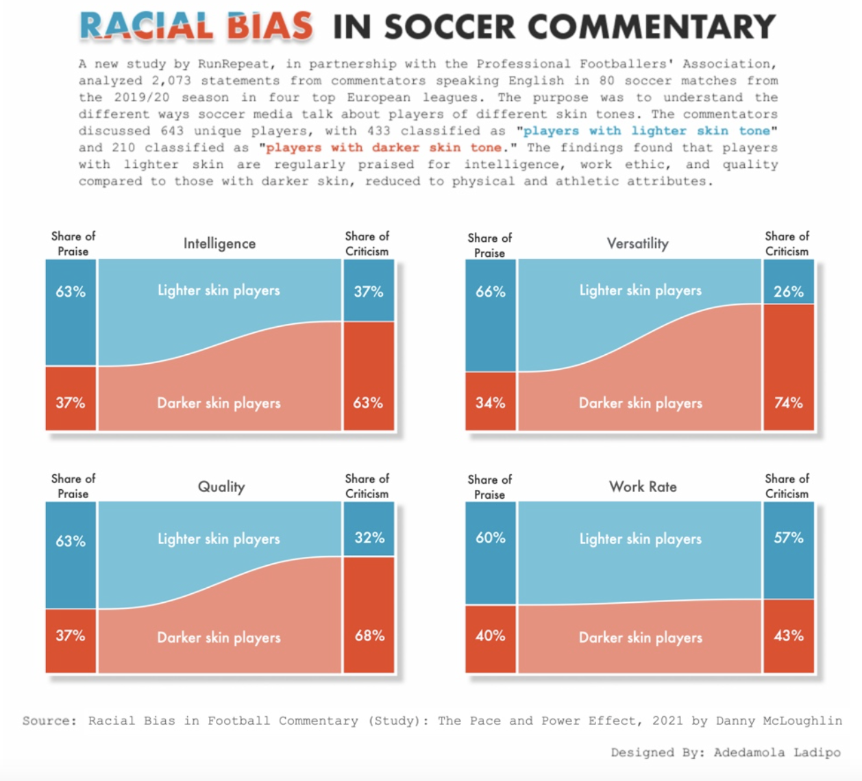
Figure 7. A simple yet impactful visualization showing the bias found in soccer commentary.
And that was it! I thoroughly enjoyed creating this simple yet impactful visualization on a topic that combines my interest in sports and social justice. I plan to develop more data visualizations on similar sports-related topics in the future. To conclude, I'll end with a quote from the original RunRepeat article from the PFA Equalities Executive, Jason Lee:
"To address the real impact of structural racism, we have to acknowledge and address racial bias. Unfortunately, this study shows an evident bias in how we describe the attributes of footballers based on their skin color.
Commentators help shape the perception we hold of each player, deepening any racial bias already held by the viewer. Therefore, it's essential to consider how far-reaching those perceptions can be and how they impact footballers even once they finish their playing career.
Suppose a player has aspirations of becoming a coach/manager. Is an unfair advantage given to players that commentators regularly refer to as intelligent and industrious when those views appear to be a result of racial bias?"
If you have not already, I recommend you check out the actual article on the study for yourself: https://runrepeat.com/racial-bias-study-soccer
Scroll through Damola's creation process.
Damola Ladipo is a data visualization specialist. He's currently at USAID Dat Services at DevTech Systems, Inc. Check out more of Damola's work on Tableau Public. His latest work is an homage to the All-Time fastest runners of the 200M dash!